

I’m not a fan of pop-ups. Like most of the Internet world, I find them at best a minor annoyance and at worst a reason to stop reading. I can’t recall a time that I ever signed up for someone’s email newsletter list as the result of a pop-up. I abandon sites when I’m assiduously and repeatedly begged to sign up for an email list. I also get extremely impatient when I’m entirely prevented from reaching someone’s homepage (or content) without first being asked to sign up for an email list—when I’m forcefully diverted to a full-on sales pitch for someone’s whatever-it-is. That always strikes me as incredibly presumptuous—shouldn’t I get to experience you or your content for at least a few seconds before you ask for my email address?
See, I’ve already digressed into how annoying these tactics are! I hope it demonstrates how reticent I’ve been, in all my years of running this site, to place any kind of pop-up that would interrupt the reader’s experience. While I know from experience and reading case studies that pop-ups work, I rarely like how they work. They feel like a trick or a betrayal of some kind. I always figure: If people really like me, then they’ll end up on my list. I only want truly devoted people.
I’ve begun to change my mind, however.
Earlier this year, I read this article on website pop-ups: How to Use Exit-Itent Popups to Grow Your Email List. It wasn’t exactly a disinterested post, as it was published by MailMunch, a service that specializes in, well, pop-ups.
But it was a really persuasive article because it shared concrete data that helped put at ease some of my anxieties about pop-ups—mainly, that they have more negative effects than positive. It showed that with an exit-intent pop-up (I’ll explain that in a moment), a site’s bounce rate remained the same. That means people weren’t leaving in higher numbers after the pop-up was added. Also, there were some pretty amazing stats on how effective the pop-ups were: one person found the pop-up drove 1375% more subscribers than a sign-up in the site sidebar. (The sidebar has been my default placement and still is for blog subscriptions.)
I was convinced it was time to try a pop-up myself. Here are the results.
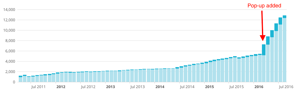
In this graph, the light blue is my existing email subscriber list; the dark blue is the number of new subscribers added each month. I added the pop-up in March 2016. I had roughly 5,200 people on my list before I added the pop-up; now I have 12,000. That means I more than doubled my list size in less than six months. Furthermore, my newsletter unsubscribe rate has not increased, although the open rate is about 5 percent less than before. My website traffic remains steady (it’s even increased a bit), and the bounce rate remains the same as before.
Here are the key reasons why I’ve changed my attitude, at least partly, toward pop-ups.
1. I’ve customized the pop-up to be as minimally intrusive as possible.
Through the use of MailMunch, I’ve been able to finely tune and control exactly how the pop-up behaves. If I weren’t able to do this, I wouldn’t use one. Here’s what I’ve done so far.
- I’m using an exit-intent pop-up. An exit-intent pop-up only appears when people leave the site. If it works as it should, then visitors are not interrupted while reading blog posts or browsing content. They only see it once they demonstrate clear intent to leave. Then the pop-up appears.
- The pop-up does not show on smartphones. Pop-ups tend to be most frustrating and annoying when you’re using a small screen and can’t easily get them to close. Therefore, my pop-up only appears to readers who are using desktops and tablets.
- The pop-up does not keep re-appearing on subsequent visits. Some of this depends on how a visitor accesses my site, but once the pop-up has been seen and closed, it should not appear again for that visitor for at least another 180 days. However, it is possible to see it again if the reader switches browsers, devices, or locations.
- It’s easy to make the pop-up go away. Some pop-ups are sneaky and don’t make it clear how to close them. My design has the traditional “X” in the corner.
- I do not guilt people into joining the list. Have you ever noticed that some pop-ups make you feel stupid for not joining someone’s list? They’ll say something like, “No, I don’t want to become a better person!” I dislike that kind of overt and silly manipulation.
MailMunch offers a variety of different behaviors and formats for your pop-up; you can make it even less intrusive by having it appear in the body of the content, in a top bar, or in a scroll box.
2. It was increasingly obvious that most visitors never saw my newsletter sign-up.
I say it again and again to other authors and publications: most people spend very little time at your site, they may never come back, and they need to be given clear calls to action.
But sometimes it’s hard to take your own advice, and I was taking the issue of reader devotion a bit too far, by thinking that someone really interested in my content will find the sign-up. Actually, no, they won’t. The simple fact is that most visitors are going to miss the majority of what’s on your site, for a million different reasons. But it doesn’t mean they’re not interested in what you have to offer, if it’s made clear and valuable to them—which brings us to our next point.
3. I have a strong call-to-action and something specific to offer.
My pop-up has a very clear value proposition that is geared toward the large majority of people who visit my site. This is what it looks like:
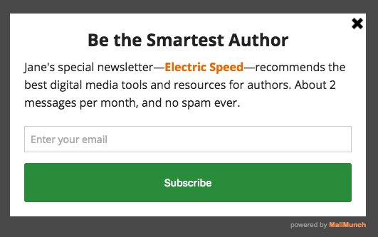
To be honest, though, I know I could do better if I added some customized visuals, as recommended here. But this quiet approach (at least as quiet as you can get with a pop-up) is more my style. I don’t like a lot of flash, and I don’t want people to feel like they’re already being sold before they enter their email address.
4. My website carries no advertising and offers a large volume of free content.
I thought it might be time to give myself permission for this one pop-up that can help me better build my email list, which is key for my business. This website and blog is at the heart of everything I do, and given the significant traffic that it attracts month after month, it would be strategically stupid of me not to build on that traffic in some way that provides a sustainable, business resource. And since I’m not interested in hosting ads, why not better advertise myself?
If you’re interested in adding a pop-up to your site, I highly recommend MailMunch. I’m still on their free plan, but they also have more advanced, paid plans. There’s lots of functionality than I haven’t even touched on, and so far I couldn’t be more pleased with the seamless and intuitive nature of their service.
Do you use pop-ups? What’s your experience been like? Let me know in the comments. And just in case you’re wondering, you can sign up for any of my newsletters here.
I’ve also written a follow-up post offering more stats and an explanation of autoresponders.

Jane Friedman has spent her entire career working in the publishing industry, with a focus on business reporting and author education. Established in 2015, her newsletter The Bottom Line provides nuanced market intelligence to thousands of authors and industry professionals; in 2023, she was named Publishing Commentator of the Year by Digital Book World.
Jane’s expertise regularly features in major media outlets such as The New York Times, The Atlantic, NPR, The Today Show, Wired, The Guardian, Fox News, and BBC. Her book, The Business of Being a Writer, Second Edition (The University of Chicago Press), is used as a classroom text by many writing and publishing degree programs. She reaches thousands through speaking engagements and workshops at diverse venues worldwide, including NYU’s Advanced Publishing Institute, Frankfurt Book Fair, and numerous MFA programs.


[…] view post at https://janefriedman.com/why-i-started-using-pop-ups/ […]
Great article with compelling data. That’s quite a jump in your subscribers.
I really, really hate intrusive pop-ups, so good for you for going with the least intrusive style you could find.
One thing: the article you link to is actually a “how to use the twitter hashtag.”
Thanks for the great info as always!
Thanks for letting me know – fixed the link!
Thank you, Jane. Your timing with this post is perfect. I’ve been dragging my feet about starting an email list. But first, let me tell you, I’ve liked your popup for Electric Speed. Very classy about how the popup meets our needs and waits until we’re ready to leave for another tab or another site. Thank you for the tip on MailMunch.
As much as popups other than yours have set my teeth on edge, I also know they work. In the early days of my horse blog, my first blog, I used a popup called “What Would Seth Godin Do?” for email RSS subscribers. It worked great, but annoyed my socks off every time I had to click back to my site to link to an old blog post. I removed it, only to see growth slow ever since, even when I was posting more frequently. As much as signup popups annoy me, they still work. Again, this bears repeating – yours is classy and an inspiration. Thank you.
Thank you, Rhonda! It’s too bad that most pop-ups are annoying—it seems to be one of those areas where the proliferation of abuse has made it hard to do right.
Great post, Jane. And timely while I’m developing my author site. And good to know that MailMunch has a free-pricing option that includes their “slide box.” And “exit intent” is a great less-intrusive way to do it. But here’s the next question: Are you also using multi-step autoresponders (beyond the opt-in steps)? I’m guessing no, although I can’t remember from when I signed up here. “Author coaches” seem hot on this idea. Maybe for a future post?
Hi Harald – I am indeed using an autoresponder that’s a 3-part welcome series, introducing people to some of my key content. Since my formal newsletter goes out only once every 2 weeks, I find the welcome series helps people remember who I am when that first email arrives, and to better understand what I offer. I haven’t done a lot of experimenting with the autoresponder, but in a future post I’ll discuss what I’ve done so far.
Sounds great, Jane. Looking forward to it.
[…] Why I Started Using Pop-Ups on My Website […]
I hate popups for exactly the reasons you say. They are essentially a punch in the nose, telling customers to #@^& off. And as for those huge unclosable pop-ups that block your entire website–they’re the equivalent of slamming the door in a customer’s face before they have a chance to look at the merchandise.Their rudeness is only surpassed by their stupidity.
But if someone has indeed invented a polite popup, I might reconsider. Especially if the popup doesn’t appear to your regular subscribers.
Hi Anne – I wish it were possible to prevent the pop-up from appearing to subscribers who visit my site, but that would require NSA-level spying capabilities. 😉
Some pop-ups do allow you to turn the pop-ups off after someone has seen it for a set amount of time, but like Jane said, I don’t know what kind of Skynet thing it would take for your pop-up to know your subscribers. Especially since people may periodically clear cookies or alternate between phone, tablet, and desktop computers. Pop-ups definitely have gotten polite-er.
Just FYI, in SumoMe, the one I use (its ListBuilder option), I can select all of the following: Do not show the popup to the same visitor again until _ days (hours, minutes, years—all are options) have passed. Do not show if already subscribed or clicked. And do not show if someone has already opted out of this app.
Ah, useful to know this, thank you so much! My assumption is that SumoMe can tell if someone is a current subscriber if that person subscribed through the pop-up and are accessing the site through same device or place. But if you subscribed through some other method, or prior to the pop-up’s use, I don’t think there’s a way it could verify.
I am vehemently opposed to pop-ups. That said, I do use Mailmunch to offer a pop-up that covers part of the sidebar. It’s much less annoying and yet still brings the mailing list to people’s attention.
I think you mentioned this (or a similar one) a while back, because I read it one day and then couldn’t remember the name so Googled it. (And you’re my main source of this kind of info, so I know I didn’t come up with it on my own.) I went with the free plan of SumoMe. I get 50-75 new subscribers a month simply because of this, and I too had the same feelings so I customized mine in the same way. DEFINITELY worth using!
I think popups are rude. If the first time I meet someone they either nag me or try to do things for them then I don’t want to meet them again. Same with websites. I find it just as annoying when they popup on leaving – I’ve then wasted my time on the site, and it feels like I’m being spied on on my own PC (i.e. the site is waiting for me to move the pointer to the close gadget).
The argument that it increases signups is the same as saying “I personally benefit from being rude/irritating, so that’s justification to be rude/irritating”. It’s not an attitude I would adopt as part of my public persona.
Many of the things that we benefit from and enjoy in life involve a variety of social contracts and compromises. I may find NPR pledge drives irritating, I may dislike ads on Facebook, and I may wish for billboards to stop appearing in the countryside, but I understand why they exist and recognize when they’re done with respect and consideration. Being online and accessing content and services for free means accepting a certain amount of advertising; if you dislike like pop-ups this much, then (if you haven’t already), turn on your browser’s ad-blocker and pop-up blocker.
One of the reasons this kind of popup is reviled is because it uses a modal overlay and isn’t blocked by Adblock Plus or the browser’s popup blocker settings. Web designers leapt onto this, which is why they proliferate everywhere like it’s the 2000s all over again. The only way to prevent them appearing is to disable browser scripting, or for website owners to accept that social media is there not for hard sell, but for giving something out in order to garner goodwill/positive relationship, which later equates to services (books, requests to speak etc). As long as people use them and support a nagging culture, we’ll have a web that increasingly tries to turn all culture and inetraction into ways of making money.
You’ve well described the business model I’ve used for the last several years to earn my living. I don’t think a pop-up that shows up 1-2x/year to the same visitor changes that.
[…] Why I Started Using Pop-Ups on My Website (Jane Friedman) I’m not a fan of pop-ups. Like most of the Internet world, I find them at best a minor annoyance and at worst a reason to stop reading. I can’t recall a time that I ever signed up for someone’s email newsletter list as the result of a pop-up. I abandon sites when I’m assiduously and repeatedly begged to sign up for an email list. […]