

Today’s post is an excerpt from the book Can You Make the Title Bigga?: The Chemistry of Book Cover Design by Jessica Bell (@IamJessicaBell).
The very first thing I’d like to mention is…
S p a c e
Not the book cover cluttered with galaxies of planets, stars and moons, but the one where you can walk into a room and not trip over the dog. A book cover with space allows the imagery and text to breathe. Utilizing space wisely draws attention to the elements that you want potential readers to focus on.
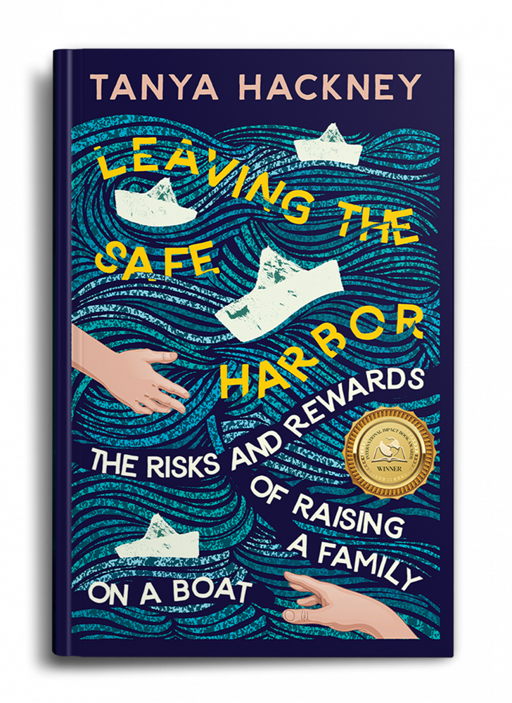
Here is a nonfiction example.

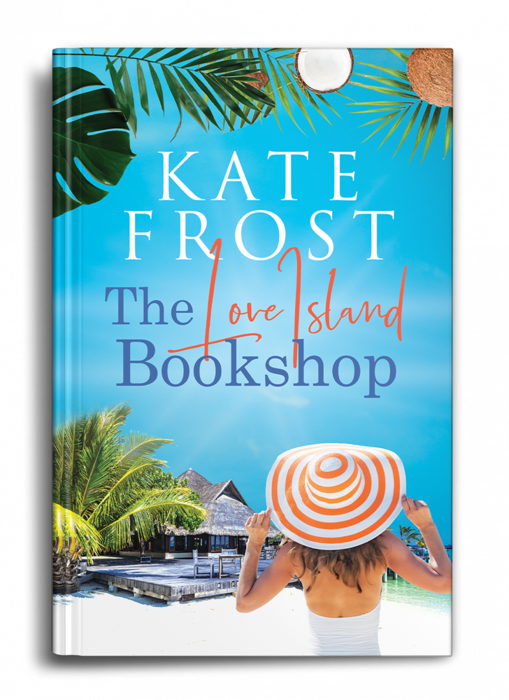
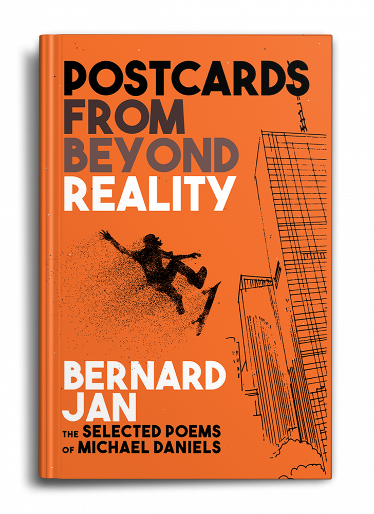
Here is an example of fiction.
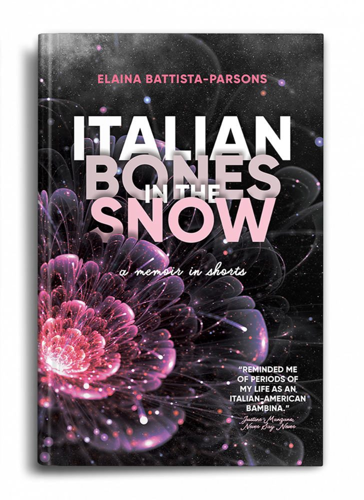
And here is an example of poetry in which I’ve taken an extreme perspective. Be sure to take a close look!
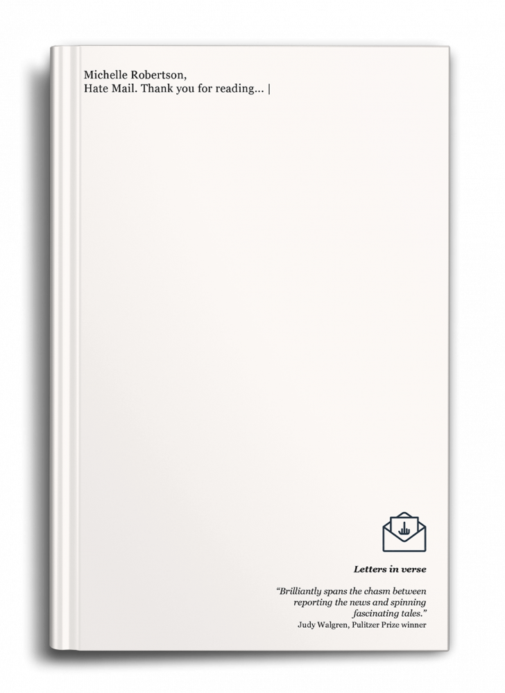
As you can see in the first two examples, there is ample space for the text to breathe, and the imagery is clear and telling. You know exactly what you’re going to get with these books, and your eye is not wandering. The space on the poetry cover, however, is used as reader bait. It’s saying, “Hey, can you read the title from there? Probably not. You’d better zoom in and check this out.” It creates a little bit of mystery and intrigue.
Avoid clutter
As I’m sure you’ve noticed in the previous examples, it’s important not to clutter a cover. If there are too many elements fighting for attention, there is no focal point, and therefore nothing to attract the eye.
However, if you have a talented cover designer, it’s possible that strategic cluttering can work. Have a look at this as an example. I’m very proud of this one.
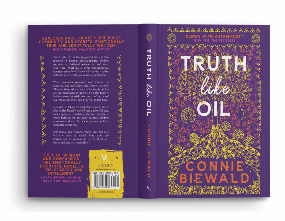
Here, I’ve pretty much filled in all available space with either text or illustration. But it’s still easy to read and understand what’s going on. This is due to the use of color. The various colors allow us to distinguish between the elements, so I’ve been able to get away with this kind of “clutter.”
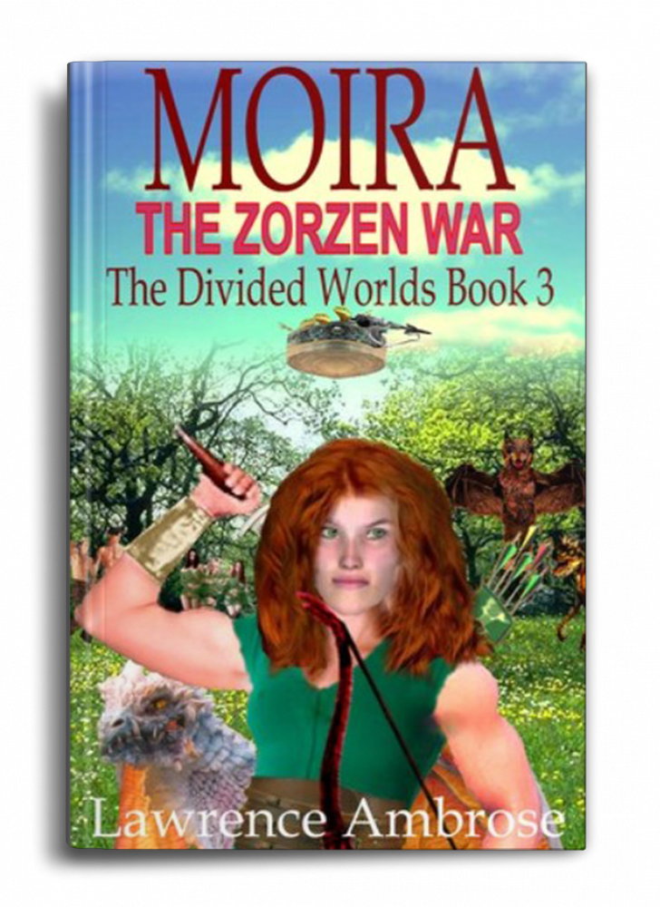
But please don’t try to fit all your story elements in, like in this example. Not mine!
Color
Too many different colors on a cover can be confusing for the eye or cause a cluttering effect. This is because colors help separate the elements on the cover, and draw attention to specific elements on a cover. I typically try not to exceed three main colors and two accent colors. In the following three covers, I’ve kept to very few for maximum effect.
Of course, this strategy doesn’t work for every genre or idea (especially when using photography), but it’s good to keep in mind that too many colors may push readers away.
The following color chart shows combinations that are a good place to start if you’re trying to decide on a color scheme for your cover. If you want to make more advanced selections, check out Adobe’s color wheel online.
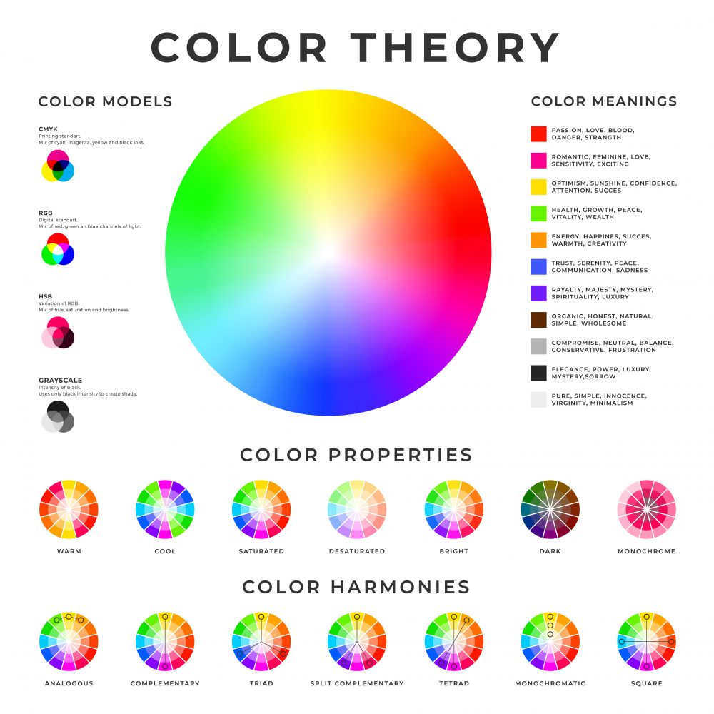
Similarly, color plays a huge role in how a cover affects us emotionally. I find that I gravitate toward purple and turquoise for their sense of calm, blues/greens with yellows/oranges/reds for their air of confidence and reliability, and contrasty color combos like red, black and yellow/white, which not only draw the eye, but really do scream, “Hey, I know what I’m talkin’ about!”
Take a look at the following chart for a list of common colors and their meanings.
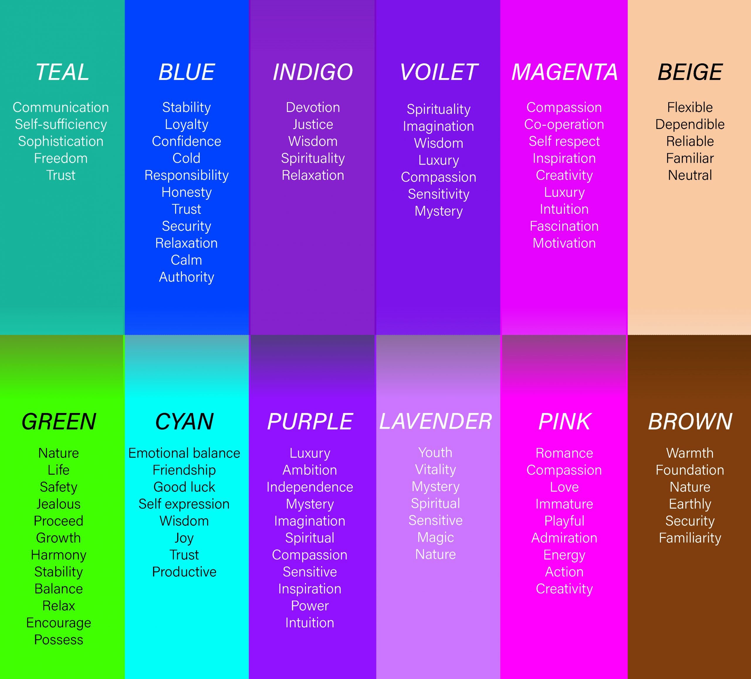
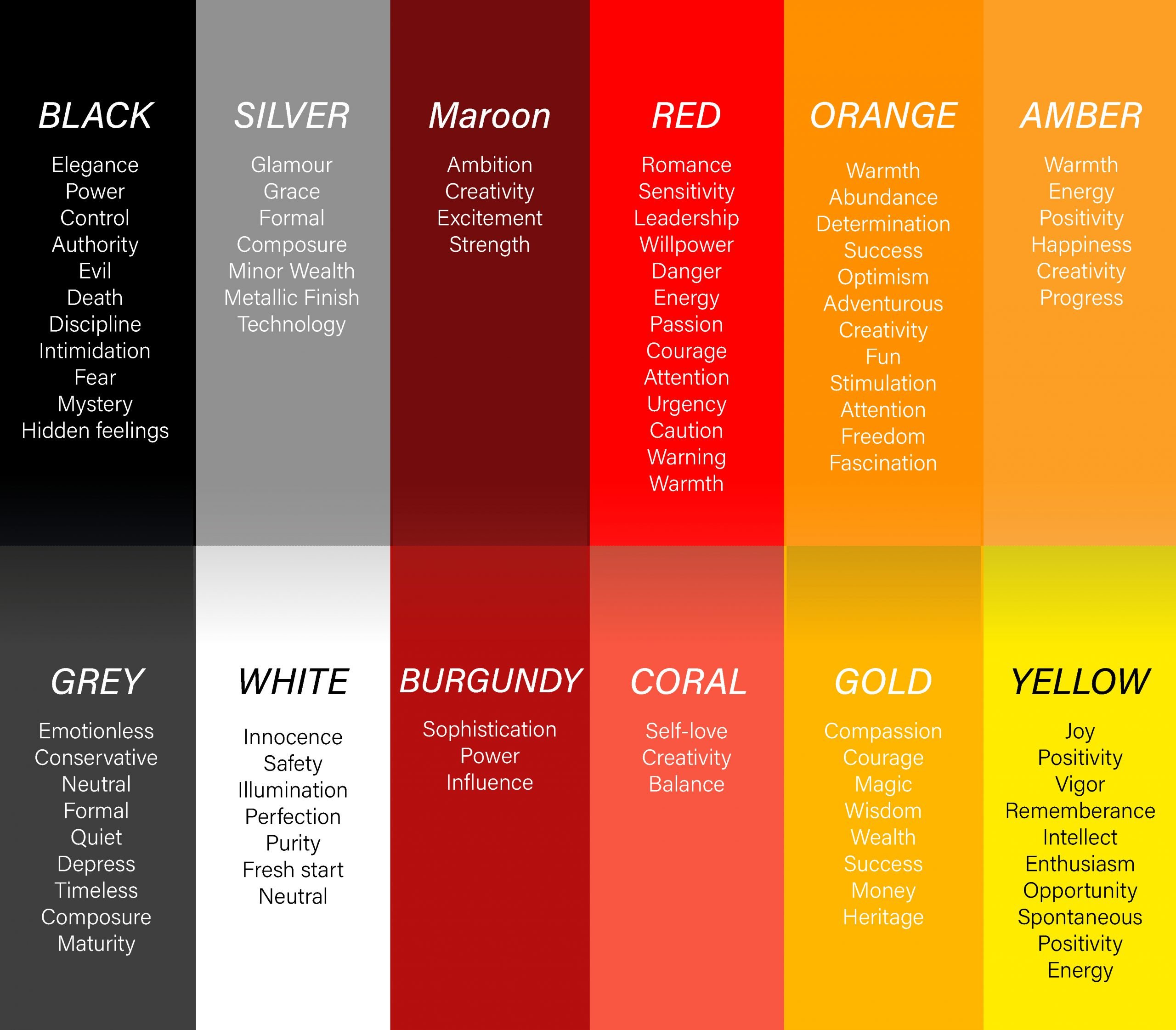
If you’re familiar with advertising tactics, you’ll know that color is used strategically in product packaging and business logos. For a more robust list with deeper explanations, just search online for “color symbolism” and the color you are looking for.
Note from Jane: If you enjoyed this post, be sure to check out Can You Make the Title Bigga?: The Chemistry of Book Cover Design by Jessica Bell.
Jessica Bell is a multi-award-winning author/poet, a highly sought-after book cover designer, and singer-songwriter who was born in Melbourne, Australia. She is also the publisher of Vine Leaves Press, and currently resides in Athens, Greece, with her partner and son, and a pile of dishes that still don’t know how to wash themselves despite her consistently teaching by example. For more information visit: iamjessicabell.com


Some very good points here. But things like color and clutter really boil down to an issue of Contrast, or specifically, Brightness Contrast. That’s what the eye is rewarded with in a good cover design.
I would like to see examples of covers that do not work. Thank you!
The psychology of color as presented in this article was of particular interest as my designer has captured the essence of my series “What She Didn’t Know” with her use of black.
Hmmm, I am not sure that I am buying this. What jumped to mind for me was “Circe” Gold and black full of design. But the “The Snow child”, stark, illuminates the tale in its own grandeur. I am not an artist. I just write books. I do enjoy a good cover however.
Super useful thanks!