
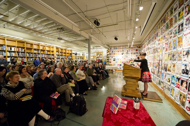
I’ve known Gigi Rosenberg by reputation for many years, as the author of The Artist’s Guide to Grant Writing, the most comprehensive book I know of on writing and winning grants. (Hint: It’s just as much for writers as it is for artists.) She’s also the editor of Professional Artist, an award-winning business magazine for visual artists with 20,000 subscribers, and is currently writing a memoir.
Last year, over a series of months, we discussed her big-picture goals for her online activity and platform, as part of a social media course I was running. We both agreed that one of her most important next steps was relaunching her author website at gigirosenberg.com.
Her new website is now in place, and the transformation is dramatic and successful. Because this is an area where I know many authors struggle to make progress, I invited her to answer a few questions about how she got it done—especially since she didn’t have to spend a fortune to do it.
What wasn’t working with your old site? How did you know it was time for a refresh?
My old site looked dated. The photos were small, the pages were narrow and it had too much text. But worse than that, it didn’t represent who I’ve become in the last nine years since I first launched my site.
Also, nothing was automatic. The events page only updated when I remembered to do it. There’s nothing worse than a two-month old event headlining your events page.
I kept procrastinating on the redesign because I had a conundrum: how could I represent myself as both a creative writer and an artist coach? Some people (including you!) suggested I make two sites. But I didn’t want that split. I’ve felt split most of my life between my creative self and my teacher self and I didn’t want to be split anymore. A new website felt like the way to bring the two sides of myself together.
This merging also made sense from a marketing perspective: my being a writer makes me a better coach because I’m shoulder-to-shoulder with all the other artists out there trying to make sense of succeeding as a creative person.

With the website relaunch and redesign, you ended up leaving WordPress and moving to SquareSpace. Deciding to change platforms is always a big deal—how did you know this was the best move?
I signed up for the free trial at SquareSpace thinking I would just fool around. But within a couple of days, I’d found a template and I’d built most of the site.
SquareSpace gave me independence. I was no longer waiting on another person to translate my ideas into a design. I could drop in photos, write text and see for myself how my words read on the page. It had the immediacy of making my site with paints and glue and cut-up images. If I were more technically savvy, maybe I could have found that with WordPress, but I liked the image-heavy designs on SquareSpace.
Mostly, I liked SquareSpace because I could work on the site myself and see how some of the conundrums starting solving themselves.
Another decision that can be difficult: whether to hire a professional designer. You work in the professional artist community, so I know the visuals of your site are critical. What was your approach?
The best advice I received from a designer colleague was: “Don’t screw with the typefaces on SquareSpace!” She reminded me that SquareSpace templates are already “designed” and the typefaces and sizes are not arbitrary. Just because I could change them easily didn’t mean I should. “Trust the design,” she said. After her advice, I stopped wasting my time, thinking I needed to “customize” my site so it wouldn’t look generic. I realized that my images and text would make it my own.
I did show the site to my designer friends for tweaking before it launched. I also hired design, editing and technical help to make small tweaks. I made sure every page was read by me and at least one other person to catch typos and inconsistencies.
So, I didn’t need a designer to build it, but designers helped get it right, at the end. The biggest benefit to using a good template is that I saved thousands by not having to hire a designer and a developer. And I really enjoyed the process of making it—a process I would have missed otherwise.
It was good for me to build it myself. It helped me define who I am and what I do. I came out in the end, feeling more confident and clear about myself as a writer and as a coach. You know you’re doing your promotion right when the work you need to do to build the site, write the press release or write your elevator speech also helps you grow as an artist.
What do you think was the most important step of your redesign process?
The most important step was the sweating it out on paper, thinking about it, hemming and hawing for two years about it, and having many conversations with designer colleagues. I lived with the conundrum until I finally felt ready to solve it. Then, the most important step was figuring out the site architecture, which came down to answering some tough questions: who’s my audience, what do I want people to do and to find easily on the site, what do you want my visitors to feel?
I asked these questions until little by little my incomplete answers kept building. So, by the time I was on SquareSpace and trying things out, all that hand wringing paid off.
Then, I had a designer/developer come in at the end. She reminded me about my vision when I forgot it and she helped refine the site architecture and fix some small design details. Then, my design colleagues gave it the once-over.
Sometimes website relaunches don’t accomplish everything we set out to do, because of time, money, resource, or limitations of the platform. Is there anything on your wish list for your site that will have to wait until later?
Believe it or not, the site is better than I imagined it could be. How often does that happen?! The site helps me remember who I am as a writer and what I do as a coach. In curating my work for the site, I was forced to look back and see how much I’ve done. In creating a page for the memoir I’m writing now, I made a placeholder for this new project to emerge. My events page, which now updates automatically, makes me want to keep scheduling events. In subtle ways, this site helped me grow as a my writer and that helped mend the split between the two sides of myself.
I’m excited to have people visit the site—it’s like when you’re happy to have people visit your new office. The site helps me be enthusiastic in the world and that’s probably that best thing you can say about any marketing effort. In the end, it’s how much it supports and inspires you to show up in a big way.

Jane Friedman has spent her entire career working in the publishing industry, with a focus on business reporting and author education. Established in 2015, her newsletter The Bottom Line provides nuanced market intelligence to thousands of authors and industry professionals; in 2023, she was named Publishing Commentator of the Year by Digital Book World.
Jane’s expertise regularly features in major media outlets such as The New York Times, The Atlantic, NPR, The Today Show, Wired, The Guardian, Fox News, and BBC. Her book, The Business of Being a Writer, Second Edition (The University of Chicago Press), is used as a classroom text by many writing and publishing degree programs. She reaches thousands through speaking engagements and workshops at diverse venues worldwide, including NYU’s Advanced Publishing Institute, Frankfurt Book Fair, and numerous MFA programs.

[…] Author Gigi Rosenberg describes how she redesigned and relaunched her author website primarily on her own, only hiring assistance at the end. […]
[…] https://janefriedman.com/author-website-redesign/ […]
[…] How to Redesign Your Site Without Spending a Fortune […]
Three simple words – Solve a problem.
An effective website should focus on solving a problem for the user. In the case of an author, you want to solve the readers problem of wanting a good book to read. They don’t want to read your tweets. They don’t want to read about what you had for breakfast. They don’t want to know about the book you’re writing.
They want you to solve their problem by identifying their needs and offering solutions.
We’re all selfish when we browse the web – we crave solutions. An effective website should provide those solutions to your target audience.