
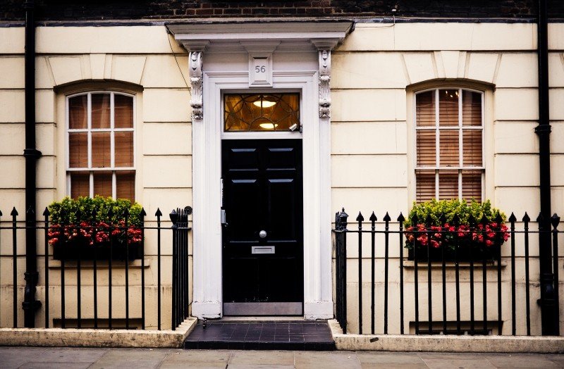
Whether you’re an emerging author or one that is well-established, it can be challenging to figure out what belongs on your website’s homepage and what to say about yourself on the front door to your online presence.
Knowing how to craft your homepage starts with knowledge of two things:
- clarity about your readership or audience—or who you’re addressing
- a focused and clear message you want to get across to that audience
If you don’t know your readership that well or your message is fuzzy, that will likely be reflected on your homepage. Since visitors to your site may not linger for more than 7 seconds at your site, it’s important to focus on what visitors should remember about you (or your work) after they leave. This requires careful consideration of your homepage copy and accompanying visuals; together, they should convey the most important aspects of your work (or your “brand”, if you want to think of it that way—but you don’t have to).
Here are the key elements of any author homepage that need to distill your message and appeal to your readership.
1. Clear identity
For authors, a clear identity equates to the name you publish under and what you publish (or who you publish for). This clear identity should be at the top of the page and the first thing that people see. Ideally the visuals tie into the work you publish (e.g., book cover designs, themes in your work, any official branding you use).
Here’s an example from novelist Barbara Freethy’s website.

She has three very effective elements here:
- An image that ties into her book covers and series
- Social proof: #1 New York Times bestselling author
- A clear statement of what she writes: Women’s Fiction, Contemporary Romance & Romantic Suspense
If you’re not a bestselling author, that’s okay. There are other forms of social proof, such as book awards, excerpts from great reviews, or praise from well-known writers or publications. Review your official bio statement for the accomplishments you’re most proud of; they might belong on your homepage as social proof.
For unpublished or emerging writers, you may not have anything yet that qualifies as social proof. That’s also okay. Your website (and homepage) is always a work in progress and evolving alongside your career. When you have something worthy to put there, add it.
Multi-genre authors, or authors who have multiple types of audiences, usually face difficult choices about what to prioritize and what messaging to use. Your homepage will typically be more effective if you focus on appealing to the audience that you want to grow or focus on the type of work that you want to be known for. Other types of work may have to take a backseat, at least as far as the homepage is concerned.
2. Your latest book or books
Visitors should see or be introduced to your most recent book (or the book most important to you) on the homepage, without having to scroll or click around to find it. Ideally, visitors can click straight to their favored retail site to make a purchase.
Again, using Barbara Freethy as an example, she shows us the cover of her latest book, with a quick summary (basically back cover or marketing copy), then links to all the retailers at the end.

Some authors will put covers of all their books on the homepage, which is fine (here’s an example from author Andrew Shaffer), but don’t assume people will scroll down a long homepage. Make sure you have a “Books” tab in your menu/navigation so people can quickly jump to or scan all your titles without scrolling.
When you’re featured in the media or online in a way that might bring people to your website, don’t hesitate to play to that on the homepage and direct people to where they can find out more information about whatever you were featured for. Don’t make people look; take advantage of their attention while you have it.
3. Links to social media sites where you’re active
If you have an active presence on Facebook, Twitter, or elsewhere, include clear icons somewhere on the homepage where they can be found quickly. Usually that means putting them in the header or footer. It’s OK to link to just one site if that’s the place where you prefer readers engage with you. Avoid linking to social media sites where you have an account, but don’t engage or actively post.
4. Email newsletter sign-up
You should have a dedicated spot for email newsletter sign-up on your homepage, or you should use a pop-up. (I discuss using pop-ups here.)
The most important part of your sign-up is the language you use when asking people to subscribe. Avoid a generic call to action, such as “Sign up for my free email newsletter.” Instead, craft the copy in such a way that no other author could use the same language. Make it unique to you and what you send.
If you also blog
Some authors who blog will put their blog front and center on their homepage. This can be a mistake unless your blog is current, popular, and compelling. For most authors I work with, it’s far better to have links to their most recent blog posts apparent on the homepage, and use the homepage to more prominently focus on their books.
If you decide to have your blog take up most of your homepage, I recommend that you not show the full text of each post. Instead, show an image + excerpt and make people click through to read, so you have room to feature a range of latest posts (without making people scroll forever), plus reserve the sidebar for some other things—like thumbnail images of your book covers.
Note what I haven’t recommended so far: a welcome message
For novelists, usually welcome messages on the homepage take up space and don’t say anything meaningful. However, such messages tend to be popular when you’re an online entrepreneur and need to state upfront what you offer a potential client or customer. (See Tara Gentile for an example.)
This approach can feel stilted and less effective for novelists especially—unless you’re trying to turn yourself into a personality and/or have the celebrity status of John Grisham. Most authors I know want to put the focus on the books, not themselves—unless they’re nonfiction authors who are also thought leaders, speakers, or otherwise public figures.
None of the above means you should avoid having a picture of yourself incorporated into your homepage design—quite the contrary—and you should do so if you’re comfortable with it.
Parting advice
Be focused in what you present on your author homepage—avoid a carnival of images, boxes and buttons. Keep it clean, with some kind of clear hierarchy or structure. Don’t expect people to linger, read, or scroll through lots of material. Most visitors will be very task-oriented; make it easy for them to find what they’re looking for, which is most likely information about you and your books.
Now it’s your turn: What has been a successful strategy for your website’s homepage?
Jane Friedman has spent nearly 25 years working in the book publishing industry, with a focus on author education and trend reporting. She is the editor of The Hot Sheet, the essential publishing industry newsletter for authors, and was named Publishing Commentator of the Year by Digital Book World in 2023. Her latest book is The Business of Being a Writer (University of Chicago Press), which received a starred review from Library Journal. In addition to serving on grant panels for the National Endowment for the Arts and the Creative Work Fund, she works with organizations such as The Authors Guild to bring transparency to the business of publishing.
[…] view post at https://janefriedman.com/author-website-homepage/ […]
I’ve been struggling with what to put on my author homepage. This article was super helpful. Thanks, Jane! 🙂
Glad I could offer this at the right time! 🙂
Good, clear post. Because my site is very personal, I’ve included a Welcome (with an additional Subscribe link). But, thanks to this post, I’ve tightened the Welcome up to be very short. So thanks for that nudge.
Good move! 🙂
This was helpful and I appreciate it a lot. I like your common-sense style and the fact that you have a lot of experience. I’ve signed up for yet another newsletter, even as I’m deleting dozens from my inbox. 🙂
Thank you, Katharine – much appreciated!
As always, I learned some new things from your advice and will be rethinking some things on my site. Thank you.
Hi Jane, Since many of us who are authors are also editors, teachers, coaches, etc., do you recommend that we have a separate website for promotion of ourselves as authors? Or is it okay to combine it all on one site? After reading this, I realize my website really favors my work as an editor and teacher and retreat designer, more than it does my publications. As usual, your column was super helpful and got me thinking!
Thanks, as always.
Hi Melanie – I always favor keeping things under one umbrella, until things reach a level of complexity with your non-author business that make that impossible (that’s pretty rare, but does happen). To help guide people quickly, just make the navigation super clear for both types of visitors you might receive.
Thanks!
Thank you so much for featuring my website design for http://www.BarbaraFreethy.com, Jane. So glad you liked it!
A terrific model to follow – kudos!
Hi Jane, great article. Focus on essentials is often a challenge for us creative folk. I have a follow-up question: how would you adapt this for a yet-to-be-published author? I have a couple of manuscripts in progress and a genre, though struggling to zero in on readership. I’d like to start an email list and have some interesting info for readers, editors, and publishers (people I meet and share a biz card with). Thoughts?
Yes! Glad I can follow-up on this. Usually, you stick to a more simplified structure, with just a 1- or 2-page site. And it’s totally OK to have nothing but a landing page more or less (just the homepage). The homepage may consist primarily a brief bio statement that mentions the projects you’re working on (e.g., “I’m working on a romance novel set in 17th century Japan”) and any accomplishments you think mentioning. Then I’d still link out to social media sites important to you, and include that email signup.
If you have any publication credits or things to link to (guest posts, articles, essays, interviews, etc), I’d create a separate page for it.
Super! Thanks for the tips.
This is a very helpful post. I am working on my first novel and I do have a short story published in an anthology. My question is WordPress. I have a review blog for indie authors with up to three books published. My landing page is my blog, I don’t have a website. I know that I can add pages. Should I continue with my blog as my landing page or should I have an introductory page? If I do have a different landing page when I post a new review on my blog, would it then go to the new page or to the blog? I hope I am explaining this clearly. Thanks so much for all of your help. 🙂
Hi Rebecca – If your review blog is always going to be a review blog (and not something focused on you as an author), then I wouldn’t worry about changing the homepage/landing page. But if you did create more of an introduction on the homepage, you could still have your latest blog posts showing there. It depends on the capabilities of your WordPress theme – but it is possible.
I agree that all those elements should be there, but I’d suggest number 4 should be number 1 for a new author. The prime purpose of a website for an author just getting going is to build their mailing list, so their reader magnet should usually be the first thing visitors see
Thanks, Kev. These aren’t necessarily listed in priority order, although I do think a clear identity comes first.
I just got a stellar idea. I am an unpublished writer with no interest in writing a novel. My jam is short stories, so I am taking your suggestion #2 with putting books on the homepage and instead putting my latest short story on the home page.
I’m working on building an audience and until I am published somewhere I want people to get a taste of what I can do, and this will be how they can right off the bat. Thank you for sharing your knowledge.