

Today’s guest post is adapted from Red Hot Internet Publicity by Penny Sansevieri.
Between Los Angeles and Las Vegas there’s a stretch of I-15 that’s just barren desert with you, sand, a cactus or two, a few vultures hoping to get lucky, and endless billboards. Most people speed down this stretch of highway as fast as possible, passing billboards at maybe 85 miles an hour. Most of the billboards you see will be fairly simple and easy to read.
If you think of your website as a billboard instead of a website, you’ll be much further along than most people. Why? Because at the rate people surf these days, your website might as well be a billboard people glance at while speeding down the interstate. You have only a snippet of time to prove your site is worthy of a visit.
Here are three ways to improve your site design with this in mind.
1. Go light on the copy.
As surfers, we don’t read, we scan. Web copy (the text on your website) isn’t about writing; it’s about writing less. We don’t want to think, we just want to click, and preferably we want to be told what to do. A well-designed site is not just one that’s light on copy; it’s also uncomplicated and very obvious.
2. Don’t clutter the homepage.
When we’re getting a site designed, we have a tendency to want to push everything onto our home page. We cram it full of every piece of everything we’ve ever done. Just like that billboard crammed with stuff, we want to fill every inch of our home page with words and pictures and all the kinds of things—which send surfers scrambling for the exit button. I call it surf shock when you land on a site that seems to scream at you from your monitor.
3. Don’t provide endless choices.
Does your site resemble Starbucks? A million buttons and links with endless choices for the user? Is it intricate and complicated? Unfortunately, while it works well for Starbucks, it won’t work for your site. Giving your user too many options turns into “analysis paralysis,” and they’ll click off faster than you can say, “double tall, non-fat, no-foam latte.”
Whatever you do and whatever your business is, your home page should have only one goal. Whether that’s selling a product, selling a service or selling you, you need to pick one overarching objective for the home page.
What’s your goal? What do you want people to do when they land on your site?
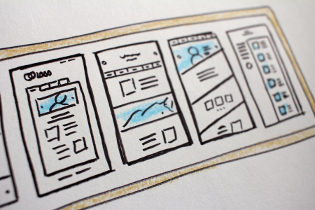
The Most Important Area of Your Site

Numerous studies have been performed about how people surf. As we discussed above, people scan text. They don’t read every word, but look for the most important pieces that will directly benefit them. Remember that it’s all about the WIIFM factor (what’s in it for me?).
In the illustration above, you’ll see three areas of my site numbered, which correspond with their level of importance.
1. This is the most important piece of the home page. The primary goal of your home page should be reflected here. If you want to sell a product, get newsletter sign-ups or any other important activity, this will be a key spot. Why? Because we read from left to right, so when someone lands on your site, they scan landing on the right side first.
2. Once the eye scans #1, it heads right over to the #2 spot with one question in mind: WIIFM? So #2 and #3 must answer that question for them. The headline is the most important part, and the copy should lead with the most important information.
When visitors land on my business page, it is not about the company or the products we have, it’s about visitors and how we can help them navigate the maze of marketing and publicity options. And did you happen to notice the calls to action on the page: Find Out More, Call Now, Download Our Catalog? It’s important to tell people what you want them to do.
Finally, bear in mind that social proof is powerful, which is why we have the row of books at the top of the page and the reference to bestsellers in the copy.
If you enjoyed this post, then take a look at Red Hot Internet Publicity by Penny Sansevieri. It’s a terrific primer on online marketing for any author getting ready to launch a book marketing campaign.
Penny Sansevieri, CEO and founder of Author Marketing Experts, Inc. (AME) and Adjunct Professor at NYU, is a best-selling author and internationally recognized book marketing and media relations expert. Her company is one of the leaders in the publishing industry and has developed some of the most cutting-edge book marketing campaigns. To learn more about Penny’s books or her promotional services, visit Author Marketing Experts (AME).


These were some great tips! Thanks! I especially like the white space reminder. I can completely forget to leave things simple, and that’s even my own browsing preference 🙂
http://forthisisthetime.com/
This is really a terrific article, Penny. That billboard visual is a great image to keep in mind. I wonder why it’s so hard to remember how we surf when we design sites for other surfers? Somehow we don’t seem to make that transition well. Thanks for a memorable image to help us remember.
Fifteen years ago making a website didn’t seem as intimidating as it does today. I need to redo both website and blog and I’m feeling overwhelmed. Simplify is what I need most to do. Thanks for the tips.
[…] everything, and your author website should be a prime driver for your sales. Penny Sansevieri has 3 ways to improve your website design. Meanwhile, David Gaughan explains how to use Amazon categories to gain visibility and drive […]
[…] https://janefriedman.com/2013/05/15/3-ways-to-improve-your-website-design/ […]
[…] has an excellent post with a different perspective on designing websites—billboards! “Three Ways to Improve Your Website Design” spouts some home truths you’d be well advised to plan around. Think about how you […]
This is really good. Am looking at a redesign of my own site and will use these tips.
Hello Mam,I am Najeed ur Rehman…I am Web Programmer and Designer but my designing is not Good.I See your Post and I feel You are good in Designing.I Need your Help..I hope you see my request and Help.If you agree to help me please Join me on skype
Regard
Najeed ur Rehman
[…] https://janefriedman.com/2013/05/15/3-ways-to-improve-your-website-design/ […]
Tutorials are the most excellent way to improve your skills.
Setting this goal for yourself ensures you don’t idle and keeps you motivated. Every
day repeats this method and at least every week is middle to achievement, and
it’s also entertaining. As soon as you recreate your favorite work portions,
you get to the same quality level as the author on that moment, and you are prepared
to the next step.
Website
designing company in Jaipur
[…] 3 Ways to Improve Your Website Design by Penny Sansevieri […]